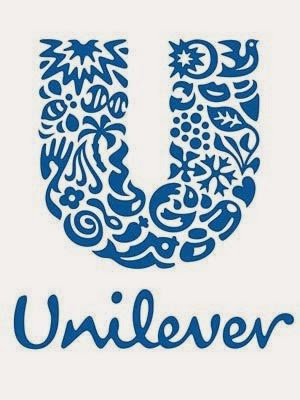
Unilever, a company that represents brands of nutrition, hygiene and personal care, cleverly incorporates symbols of what they represent into their logo. Their target audience is to the everyday person either looking for products to make them feel good about themselves or for hygienic products for them and their family. The color choice of Unilever's logo, indigo blue, represents the company's clean feeling. Incorporated in the logo are symbols like a sun, DNA, a hand, a heart, tea, a recycling symbol and more, which are arranged to create the U shape. Each of theses symbols incorporated in the logo represent something that Unilever represents, making their logo much more meaningful and creative which helps it stand out among the rest.

What makes Federal Express's logo stand out is the hidden image of an arrow incorporated in the logo. Federal express is a global delivery service, the hidden arrow between the "e" and the "x" represents movement and speed, two characteristics the company strives to represent. The name of the company is also shortened to help simplify the logo, but still get the point across. The color choice of purple and orange are contrasting colors which make the logo stand out. This logo is simple, yet clever with its color choice and hidden symbol.

Nike, a company devoted to selling activewear and accessories, used the "swoosh" logo to represent their company. The "swoosh" logo attracts their target audience of athletes and people living active lifestyles because it symbolizes motion and speed. This logo is simple in its design and solid color, which makes it adaptable to almost every product Nike sells.
LG, a company who sells electronics, has a very futuristic and stylised logo which represents exactly what the company stands for. Both the shape and the color of this logo is very important to the company. The letters L and G are cleverly positioned in the logo to make a face, representing humanity and the efforts to keep close relationships with their customers. The main red color of the logo represents friendliness and the importance to deliver the best. The simple, modern, and distinctive design of this logo attracts the customer and expresses what the company stands for.
Baskin Robins, an ice cream company which has 31 ice cream flavors made for everyday of the month, brilliantly showcases that number in their logo. At first glance it looks like the letters B and R, but with a close look the number 3 is used to create the B and the number 1 is used to create the R. The blue color used in this logo represents quality and excellence of their product and the pink represents the same color of the spoon given with the ice-cream. This logo gives off a "sweet" feeling with the color choices and the font used gives off a "fun" feeling, which works for the company and attracts the customer.
No comments:
Post a Comment